fx - DYNAMIC MARKER SETTINGS

Home navigation:   NPGeoMap Properties Dialog > Dynamic Marker & Lines > DynamicMarker Presentation >

fx - DYNAMIC MARKER SETTINGS

Zum deutschen Handbuch wechseln NPGeoMap

Version 2.50.84, 07.12.2017

COORDINATES
Setting coordinates of Dynamic Markers, Endmarkers and Paths.

MARKER SETTINGS
Features for setting functionality and presentation (Labels, PopUps, MouseOvers/Tooltips, HTML Notes...) of Markers.

Marker Charts:

ImageChart
Features for setting Charts as images on Markers.

PopupChart
Features for setting Charts in Marker PopUps.

END MARKER SETTINGS
Features for setting functionality and presentation (Labels, PopUps, MouseOvers/Tooltips,...) of Endmarkers.

End Marker Charts:

ImageChart

Features for setting Charts as images on Endmarkers.

PopupChart

Features for setting Charts in Endmarker PopUps.

LINE AND PATH SETTINGS
Features for setting functionality and presentation (Labels, PopUps, MouseOvers/Tooltips,...) of Lines/GreatCircles and Paths.

LINE BAR CHARTS SETTINGS
Features for displaying Bar Charts along Lines or Paths directly on the map (like several layers of stroke widths with dynamic values and colors) - set the Data, the Colors and a MouseOver.

Forward Bar Chart Data
Settings for the direction from A to B.

Backward Bar Chart Data

Settings for the direction from B to A.

click to expand

click to expand


The values for nearly all features may be entered as calculated formulas or variables.

For detailed information about notation in this dialogs go to chapter The fx‑editor.

DYNAMIC MARKER SETTINGS

SETTING / VALUES

EXPLANATION


COORDINATES

In this section coordinates for Markers, Endmarkers and Paths can be set.

Marker

coordinates


Set coordinates for Dynamic Markers.
Dynamic Markers have to be WGS 84 projection format.

Notation (also valid for Endmarkers and Paths):
First comes latitude, then longitude (hint: in NPGeoMap always in alphabetical order - LAT, LON). They have to be separated with a comma and the decimal separator has to be a dot (Example: 48.207854, 16.369722).
Several coordinates are separated with a semicolon (to link several coordinates you can also use the Sense formula Concat()). In your data model this notation should be applied too.
Manually filled in coordinates are handled as string, that's why they have to be quoted.

Basically there are three different ways to load the coordinates:

oLoad coordinates out of the data model, both coordinates (lat. and lon.) are in one column.

oLoad coordinates out of the data model, coordinates (lat. and lon.) are in two separated columns.

oOne or more coordinates are filled in manually (theoretically).

Example for loading coordinates out of the data model:

Latitude and longitude are in one column:
& '#Marker=' & COORDINATES_Markers

Latitude and longitude are in two separated columns:
& '#Marker=' & Concat(DISTINCT COO_A & ',' & COO_B,';')

Formula templates like this are in every Dialog.

Example for filling in coordinated manually (theoretically):
& '#Marker=' & '48.207854, 16.369722; 52.519307, 13.400260'

You can also use coordinates in Encoded Polylines format - more information at developers.google.com.
Tip: Enabling this feature in the Expert Settings is a easy way to locate possibly faulty Marker coordinates.

EndMarker

coordinates


Set coordinates for Dynamic Endmarkers.

Basically Endmarkers work the same as Markers (see description above). Even the notation is exactly the same. If you only want to display a group of Dynamic Markers there's no difference whether you set the coordinates in the feature Marker or in EndMarker. But as soon as you want to connect two different groups of points and the direction (!) is significant, it's important to set the coordinates in the right feature. For example a Line always starts with a Marker and ends in a Endmarker. So do Arrows.

The following constellations of Markers, Endmarkers and the features LineType and LineArrow (both in this dialog further below) are possible:

1.Several Markers and several Endmarkers with LineType 0 (no connection),
for two independent groups of Markers, separated configurable.
(Another way to do this is by setting Simple Marker groups.)

2.Several Markers and several Endmarkers with LineType 1 or 2 (Lines or GreatCircles),
for one-to-one connections, each between a Marker and a Endmarker.

3.One* Marker and several Endmarkers with LineType 1 or 2 (Lines or GreatCircles),
for one-to-many connections - LineArrow could be set additionally at 1 or 2.

4.Several Markers and one* Endmarker with LineType 1 or 2 (Lines or GreatCircles),
for many-to-one connections - LineArrow could be set additionally at 1 or 2.

5.Combinations of all above.

*The system always connects a Marker with a Endmarker, in the order they are loaded - the first coordinates of the Markers with the first coordinates of the Endmarkers, then the second coordinates of the Markers with the second coordinates of the Endmarkers and so on.
Therefore if you want to create a one-to-many connection (or many-to-one), just set the same coordinates in the Markers (Endmarkers) for every Endmarker (Marker) you want to end up in. The resulting "centers" could of course appear several times - for five Markers there are five times the same coordinates for the "center" Endmarker and for another ten Markers there are ten times the other same coordinates for the "center" Endmarker, etc..
If there is not the same number of coordinate points in the Markers and in the Endmarkers, the surplus coordinates are displayed as points.

Example:

given Markers    = A, A, B, C

given Endmarkers = 1, 2, 3

Result:

Line from A to 1
Line from A to 2
Line from B to 3
Point at C

(This theoretical example is displayed in screenshot 5 on the right.)

1. two independent
groups of Markers

click to expand

click to expand

2. one-to-one
connections

click to expand

click to expand

3. one-to-many
connections

click to expand

click to expand

4. many-to-one
connections

click to expand

click to expand

5. mix

click to expand

click to expand

Path

coordinates


Set coordinates for Dynamic Lines or Paths.
The notation is the same as for Markers or Endmarkers above. Paths are created if several points are connected with a line one after another. You may also set map or polygon coordinates here, to display them as Polylines.
Polylines are especially used for floorplans and layouts, construction outlines or technical drawings. You may even set Polygon or Map coordinates here - for instance the column "COORDINATES" in NPGeoMap maps. In this way Maps are handled like Lines.

The order of the coordinates determines the direction of the Line or Path - this is important if you want to set arrows on the lines.
If you want to display several Paths, the coordinates must be connected to a Dimension in the data model. The best is to add a name, color, etc. for each Path as well, so that you only have to set a variable or a Field in the fx‑editor.
Additionally you can set the LineType (in this dialog further below) to 1 for connecting the points and for instance displaying rail or subway lines or to 3 to display Bar Charts on the lines - see more at Line Bar Charts.

Script-example of two Metro lines with stations and sections:

LOAD * INLINE [
   ROUTE, SECTION, COORDINATES, COLOR
   M1, station1-station2, "48.208060, 16.371446; 48.209314, 16.365499", red
   M1, station2-station3, "48.209314, 16.365499; 48.213762, 16.362221", red
   M1, station3-station4, "48.213762, 16.362221; 48.221567, 16.367805", red
   M2, stationA-stationB, "48.196855, 16.358883; 48.201305, 16.369019", blue
   M2, stationB-stationC, "48.201305, 16.369019; 48.202559, 16.379094", blue
   M2, stationC-stationD, "48.202559, 16.379094; 48.202437, 16.391110", blue
];

Further below in this dialog you find a lot of settings for the appearance of Lines and Paths.

click to expand

click to expand


MARKER SETTINGS

In this section there are all features for setting functionality and presentation (Labels, PopUps, MouseOvers/Tooltips,...) of Markers.

Type

number

Marker type, number from 0 to 7 (default is 2)

Set the Marker type/shape in which Markers are displayed:

0 = don't show Markers

1 = don't show Markers, but the Label

2 = circle (default)

3 = triangle

4 = square

5 = pentagon

6 = hexagon

7 = Heatpoint for Heatmaps

The feature MarkerImageURL allows to display any image instead of a shape for Markers or small Charts with ImageChart (both in this dialog further below).

Performance tip: Circles need the least rendering time. If you have many Markers, Type 2 is the fastest at loading.

Size

number

Marker size (default is 8)

Radius of Markes or Marker Images.
The unit depends on the setting of the feature Marker Units in the menu group Basic Settings. It can be pixel or meter (default is pixel).
Radius for Images means half of the width of them, like: If you set the radius 5px, the Image will be rendered in 10px width (the relative height is calculated automatically).

See further possibilities for setting Marker sizes in feature MarkerImageURL.

Size%

KPI

number value for size Classes

Set here a KPI or other number values (for example Sum(Sales)) instead of a size to determine the Marker sizes with Classes.
The Classes themselves can be configured in the fx‑editor COLOR & SIZE CLASSES.

KPI

your indicator

your Key Performance Indicator (default is 0)

Set your KPI (Key Performance Indicator).
It may be used as a calculation basis for determining sizes or colors by Classes for the Circle Cluster Markers or the Hexagon Grid Clusters.

AnimID

text

alphabetical order of objects to be animated

Set order of animation.
To sort and arrange the order, in which objects should be animated, a special ID can be set here. Basically this ID is all in one for all objects. That means there are four settings like this:

for Dynamic Markers (this feature)
for Dynamic Endmarkers
for Lines and
for Dynamic Maps

The content of all these features is summed up and sorted alphabetically. The result is the order of animations.
If several objects have the same ID, they will be animated at the same time - in this way animation groups can be configured.

Animation properties itself (duration, effects) can be set in the Expert Settings.

Color

color

Marker fill color (default is orange)

Marker fill color.

When setting colors you can use Hex-Codes, HTML color names or RGB
Example: color red = #FF0000 or red or RGB(255, 0, 0)
(Detailed information in chapter The fx-editor)

Color%

KPI

number value for color Classes

Set here a KPI or other number values (for example Sum(Sales)) instead of colors to determine the colors or even images with Classes.
The Classes themselves can be configured in the fx‑editor COLOR & SIZE CLASSES.

BorderColor

color

Marker border color (default is orange)

Marker border color.
If you don's set any value here, no border will be rendered.

When setting colors you can use Hex-Codes, HTML color names or RGB
Example: color red = #FF0000 or red or RGB(255, 0, 0)
(Detailed information in chapter The fx-editor)

BorderWidth

number

Marker border width (default is 2)

Marker border width.

Opacity

number

Marker transparency in percent (default is 50)

Transparency of the fill color of Markers in percent:

0% - colors are covering
100% - completely transparent

Popup

content

Marker PopUp content

A PopUp is a kind of dialog or a small window, that opens or "pops up" if you click on an item (Marker, Polygons,...), for which a PopUp is defined. NPGeoMap can display text and dynamic content in a PopUp.
The whole PopUp content can be edited with HTML.

Further below in the PopUp Charts you can also add Charts to Marker PopUps. With the feature qvchart it is possible to even display any Sense object or chart in this PopUp. The content you add at this point will appear just above the chart.

click to expand

click to expand

000_warning Important: If you want to use local image files, you have to indicate the following Sense image path:

../Extensions/NPGeoMapSense_v2.50/images/[...]

Example with image:

& '#Popup=' & '<div style="text-align:center; background:#F0F0F0; padding:5px; border: 5px solid gray;border-radius:10px "> PopUp <br>
             <img src="Extensions/NPGeoMap_v2_3/images\flag.png" alt="Company Logo" style="align:center;width:50px;">
              </div>'

You can copy-paste this example to try it yourself!

If the feature "popupautoclose" is disabled in the Expert Settings, you may keep several PopUps open at the same time.

The following NPGeoMap #Hashtag Variables are provided, for additional information about the coordinates:

[#Latitude] (WGS84 Latitude coordinate)

[#Longitude] (WGS84 Longitude coordinate)

[#PRJ=EPSG:xxx] (converts the variables above by provided EPSG Code)

Example:

simple:
& '#Popup=' & '[#Latitude] / [#Longitude]'

converted:
& '#Popup=' & '[#Latitude] / [#Longitude] [#PRJ=EPSG:31252]'

integrating GoogleMaps Streetview:
& '#Popup=' & '<iframe width=600 height=450 frameborder=0 style=border:0 src=https://www.google.com/maps/embed/v1/streetview?key=[yourGoogleMapsKey]&location=[#Latitude],[#Longitude]&heading=0&pitch=10&fov=35 allowfullscreen></iframe>'


Check it out!

(See details about notation in chapter fx‑editor).

000_pinTip: There's a CSS file "info.css" located in the NPGeoMap Extension directory (subfolder "css"), which can be customized to define the default presentation of PopUps, MouseOvers and SketchBoxes.
(If you configure this file make sure to save a backup, when installing an NPGeoMap update - the actual file will probably be replaced.)

More information about integrating Sense fields or formulas and further details on notation see chapter fx-editor.

MouseOver

content

Marker MouseOver content

MouseOver (Tooltip) for Dynamic Markers.
It appears next to the cursor, if it hovers on a Dynamic Marker.
This text may contain HTML, like for example a <br> tag to set a line break. Furthermore a delay and the duration time of MouseOvers can be configured in the Expert Settings.

click to expand

click to expand

Use Sense variables, fields and formulas for dynamic content.

Example:

& '#MouseOver=' & 'Hello World'
Example with dynamic content (see sceenshot on the right):
& '#MouseOver=' & CustomerName & ' from ' & Customerlocation & ',<br>Sales: ' & Money(CustomerTurnover)


000_warning Important: If you want to use local image files, you have to indicate the following Sense image path:

../Extensions/NPGeoMapSense_v2.50/images/[...]

Example with image:

& '#MouseOver=' & '<div style="text-align:center; background:#F0F0F0; padding:5px; border: 5px solid gray;border-radius:10px "> MouseOver <br>
           <img src="Extensions/NPGeoMap_v2_3/images\flag.png" alt="Company Logo" style="align:center;width:50px;">
            </div>'

You can copy-paste this example to try it yourself!

000_pinTip: There's a CSS file "info.css" located in the NPGeoMap Extension directory (subfolder "css"), which can be customized to define the default presentation of PopUps, MouseOvers and SketchBoxes.
(If you configure this file make sure to save a backup, when installing an NPGeoMap update - the actual file will probably be replaced.)

More information about integrating Sense fields or formulas and further details on notation see chapter fx-editor.

Label

content

Marker label

Marker labels are displayed below the Markers, however you can additionally configure the offset and further settings for labels in the menu area Marker Label Settings outside this expression dialog. Basically labels contain only text, but you can use variables and formulas.
Labels can be edited with line breaks (using Chr(13)), but it's not possible to use HTML.

Note

content

note content

Configure a HTML Note, displayed at the lower right corner of each Marker.

Unlike PopUps the Notes are displayed all at once and at the time - even if you work in the app. The Layerswitcher can hide and unhide the Notes at any time.
They may be used as a kind of caption or labeling, but as they are able to process HTML content, they need more loading time - therefore Notes are only suitable for smaller amounts of Markers.

click to expand

click to expand

It's recommended to configure the Notes within a <div> tag.

Example:

& '#Note=' & '<div>Note</div>'

Example with background color:

& '#Note=' & '<div style="text-align:center; background:#F0F0F0; padding:5px;">Note</div>'

Some tips:
You can use HTML SVG to draw shapes and graphics - see more at w3schools.com/graphics/svg.
Use RGBA colors to set a background opacity.
The borders may be rounded at the corners by using "border radius".
The setting NotePosition right below allows you to define the position of the Notes.

000_warning Important: If you want to use local image files, you have to indicate the following Qlik Sense image path:

../Extensions/NPGeoMapSense_v2.50/images/[...]

Example with image:

& '#Note=' & '<div style="text-align:center; background:#F0F0F0; padding:5px; border: 5px solid gray;border-radius:10px "> Note <br>
           <img src="../Extensions/NPGeoMap_v2_3/images\flag.png" alt="Company Logo" style="align:center;width:50px;">
            </div>'

Example with a Qlik Sense formula:

& '#Note=' & '<div>' & Now() & '</div>'

You can copy-paste the examples to try it yourself!

More information about integrating Qlik Sense fields or formulas and further details on notation see chapter fx-editor.

NotePosition

type

relative position of Note to related Marker

The position of Notes can be defined in relation to their respective Marker.
By default they are rendered bottom right "br".
This technique is not accurate when the Notes have different measures. To prevent unwanted behavior, Notes should always be configured inside a <div> tag. When the div tag has the same size for all Notes, the result will be as expected. If the div tag is configured transparent (no border, no background), the actual Notes inside may then look different, while keeping them on the correct position.

Available position types:

tl = top left

tr = top right

bl = bottom left

br = bottom right

cl = center left

cr = center right

ct = center top

cb = center bottom

cc = center center

click to expand

click to expand

MarkerImageURL

file path or SVG

file path of a image or SVG to be displayed as Endmarker

A Marker may also be displayed as an image, instead of a shape - just set the file path of the image you want to use. The Marker Type needs to be set on 2.
The image file itself has to be stored within the NPGeoMap Extension Directory in the sub folder "images" or below.

Example (file in folder "image"):

& '#MarkerImageURL=' & 'flag.png'

Example (file in sub folder "demo"):

& '#MarkerImageURL=' & 'demo/airplane.png'

Example (screenshot):

& '#MarkerImageURL=' & 'office_11.png'

You can copy-paste the examples to try it yourself!

image file:

click to expand

click to expand

There are three levels/possibilities to set the size of the Marker Images:

oOutside this dialog in the menu area Marker Image Settings
- same size for all Images - offset/position can be configured

oin the Feature Size
- dynamic and individual sizes for all Markers

oor in the Feature Size%
- automatically calculated sizes based on number values and steered by Classes - Images are always centered

A Class may also be used to display various images - more.
Tip: It's possible to use animated GIFs.

SVG images:
Instead of setting an image file you can use SVG to draw a image on the fly. In this way you can use Qlik Sense Fields, Formulas and Variables to draw images with dynamic content.
SVG defines vector-based graphics in XML format using the following basic structure:

<svg width="30" height="30" xmlns="http://www.w3.org/2000/svg" version="1.1">
...
</svg>

Just replace width and height by your needed sizes and add svg components like: circles, polygons, text...
Read more about SVG at w3schools.com/graphics/svg_intro.

SVG image:

click to expand

click to expand

000_warning It is important to include the "xmlns" attribute, "width" and "height" and optionally in addition the "version".

Example circle:

& '#MarkerImageURL=' & '<svg width="30" height="30" xmlns="http://www.w3.org/2000/svg" version="1.1">
 <circle cx="50%" cy="50%" r="10" fill="white" stroke="red" stroke-width="5"/>
 </svg>'

Example polygon:

& '#MarkerImageURL=' & '<svg width="30" height="30" xmlns="http://www.w3.org/2000/svg" version="1.1">
<polygon points="20,0 25,20 15,20" style="fill:lime;stroke:purple;stroke-width:1" />
 </svg>'

Example with dynamic content (screenshot):

& '#MarkerImageURL=' & '<svg width="130" height="130" xmlns="http://www.w3.org/2000/svg" version="1.1">
 <circle cx="50%" cy="50%" r="48" fill="navy" stroke="white" stroke-width="2"/>
 <circle cx="50%" cy="50%" r="40" fill="white" />
 <text x="50%" y="55%" font-weight="bold" text-anchor="middle" font-family="Verdana" font-size="12">'& Capital &'</text>
 </svg>'

You can copy-paste this example to try it yourself - just replace the Qlik Sense field "Capital" by a existing one.


ImageChart

A Marker can also be displayed by a small Chart instead of a shape or an Image.
There are three levels/possibilities to set the size of the Marker ImageCharts:

oOutside this dialog in the menu area Marker Image Settings

o - same size for all ImageCharts - offset/position can be configured

oin the Feature Size
- dynamic and individual sizes for all Marker ImageCharts

oor in the Feature Size%
- automatically calculated sizes based on number values and steered by Classes - ImageCharts are always centered

000_warning If you edit anything in this section, make sure to enable the line "& '#ImageChart='" as well, in order to let the system know where you are working.

Type

number

Chart type, number from 0 to 6 (default is 1)

Set the ImageChart type:

0 = no Chart

1 = Pie

2 = Doughnut

3 = Horizontal Bar

4 = Vertical Bar

5 = Line

6 = Curved Line

example for
ImageChart type pie:

click to expand

click to expand

Data

data

Chart data (default is 400|900)

ImageChart data.
The data has to be separated by a vertical bar/pipe character* | .
*In most cases this character is somewhere in the third level of the keyboard, available by pressing  Alt Gr .

Label

content

Charts labels (default is A|B)

ImageChart labels.
This feature refers to the lettering along the axes with bar charts and the ones pointing at the pie chart pieces. The labels have to be separated by a vertical bar/pipe character* | . Basically they contain only text, but you may configure them by using Sense fields or variables (Notation see chapter fx‑Editor).
If you don't fill anything in here or remark the line, no labels will be displayed.
The size of the charts always includes the labels - therefore setting labels or not has an important impact on their presentation.
*In most cases this character is somewhere in the third level of the keyboard, available by pressing  Alt Gr .

Color

color

Chart colors (default is red|yellow)

ImageChart colors.
If you don't fill anything in here or remark the line, the ImageChart will be displayed in the default colors. The default colors can be edited in the Expert Settings. When there is more data set than colors in this feature, first it goes on with the default colors and then they all will be repeated.
The data has to be separated by a vertical bar/pipe character* | .

When setting colors you can use Hex-Codes, HTML color names or RGB
Example: color red = #FF0000 or red or RGB(255, 0, 0)
(Detailed information in chapter The fx‑editor)

*In most cases this character is somewhere in the third level of the keyboard, available by pressing  Alt Gr .


PopupChart

Charts can also be displayed in PopUps. The Chart set here will appear below the content set in the regular PopUp of the Dynamic Markers (see few lines above). If no Marker PopUp is set, only the Chart will be displayed in the PopUp.
You can also display any Sense visualizations instead of the NPGeoMap Chart in this PopUp, by using the feature QVChart below.
The NPGeoMap Charts are dynamic - you can make selections in the Charts, with pie Charts by clicking on the pieces and with bar or line Charts by dragging areas.

Type

number

Chart type, number from 0 to 7 (default is 4)

Set the PopupChart type:

0 = no Chart

1 = Pie

2 = Doughnut

3 = Horizontal Bar

4 = Vertical Bar

5 = Line

6 = Curved Line

7 = Sense Chart (see following feature QVchart)

example for PopupChart type
Vertical Bar:

click to expand

click to expand

QVChart

Sense object ID

Sense object ID

Feature for displaying any Sense visualizations in the PopUp, instead of a NPGeoMap Chart. Just fill in the Sense object ID of the visualization you want to use. See here a description in the Sense Manual how to get the object ID: help.qlik.com/obtain-app-object-id
Basically all kinds of Sense objects can be used, however this feature is optimized for displaying Sense Charts. The only requirement is to keep the Sense object in the same app.
By using the PopUp Variables in the Expert Settings the Sense visualization can be restricted to the values of the variables, like for example the current selections.
The size of the qvchart is defined by the two features below "width" and "height".

click to expand

click to expand

Data

data

Chart data (default is 400|900)

PopupChart data.
The data has to be separated by a vertical bar/pipe character* | .
*In most cases this character is somewhere in the third level of the keyboard, available by pressing  Alt Gr .

Label

content

Charts labels (default is A|B)

PopupChart labels.
This feature refers to the lettering along the axes with bar charts and the ones pointing at the pie chart pieces. The label above the chart is the title. If you don't fill anything in here or remark the line, no labels will be displayed.
The labels have to be separated by a vertical bar/pipe character* | .
*In most cases this character is somewhere in the third level of the keyboard, available by pressing  Alt Gr .

click to expand

click to expand

Color

color

Chart colors (default is red|yellow)

PopupChart colors.
If you don't fill anything in here or remark the line, the PopupChart will be displayed in the default colors. The default colors can be edited in the Expert Settings. When there is more data set than colors in this feature, first it goes on with the default colors and then they all will be repeated.
The data has to be separated by a vertical bar/pipe character* | .

When setting colors you can use Hex-Codes, HTML color names or RGB
Example: color red = #FF0000 or red or RGB(255, 0, 0)
(Detailed information in chapter The fx‑editor)

*In most cases this character is somewhere in the third level of the keyboard, available by pressing  Alt Gr .

Title

content

Chart title

PopupChart title.
This feature allows to add a title to the Chart - see screenshot on the right. Additionally the content of the regular Marker PopUp would appear above the title, if defined.

click to expand

click to expand

Width

number

Chart width in pixel (default is 350)

PopupChart width.
If not defined, an automatic size is calculated by the system.

Height

number

Chart height in pixel (default is 200)

PopupChart height.
If not defined, an automatic size is calculated by the system.


END MARKER SETTINGS

Endmarkers are basically the same as Markers. However if Lines are configured, they always start at a Marker and end at an Endmarker. Therefore Endmarkers make the difference when using one-to-many connections or showing directions. 
In this section there are settings for the presentation of Endmarkers and for the configuration of Charts and PopUps.

Type

number

Endmarker type, number from 0 to 7 (default is 2)

Set the Endmarker type/shape in which Endmarkers are displayed:

0 = don't show Markers

1 = don't show Markers, but the Label

2 = circle (default)

3 = triangle

4 = square

5 = pentagon

6 = hexagon

7 = Heatpoint for Heatmaps

The feature MarkerImageURL allows to display any image instead of a shape for Markers or little Charts with EMImageChart (both in this dialog further below).

Performance tip: Circles need the least rendering time. If you have many Endmarkers, Type 2 is the fastest at loading.

Size

number

Endmarker size in pixel (default is 8)
 

Radius of Endmarker or Endmarker Images.
The unit depends on the setting of the feature Marker Units in the menu group Basic Settings. It can be pixel or meter (default is pixel).
Radius for Images means half of the width of them, like: If you set the radius 5px, the Image will be rendered in 10px width (the relative height is calculated automatically).

See further possibilities for setting Marker sizes in feature MarkerImageURL.

KPI

your indicator

your KPI (default is 0)

Set your KPI (Key Performance Indicator).
It may be used as a calculation basis for determining sizes or colors by Classes for the Circle Cluster Markers or the Hexagon Grid Clusters.

AnimID

text

alphabetical order of objects to be animated

Set order of animation.
To sort and arrange the order, in which objects should be animated, a special ID can be set here. Basically this ID is all in one for all objects. That means there are four settings like this:

for Dynamic Markers
for Dynamic Endmarkers (this feature)
for Lines and
for Dynamic Maps

The content of all these features is summed up and sorted alphabetically. The result is the order of animations.
If several objects have the same ID, they will be animated at the same time - in this way animation groups can be configured.

Animation properties itself (duration, effects) can be set in the Expert Settings.

Color

color

Endmarker fill color (default is gold)

Endmarker fill color.

When setting colors you can use Hex-Codes, HTML color names or RGB
Example: color red = #FF0000 or red or RGB(255, 0, 0)
(Detailed information in chapter The fx‑editor)

BorderColor

color

Endmarker border color (default is gold)

Endmarker border color.
If you don's set any value here, no border will be rendered.

When setting colors you can use Hex-Codes, HTML color names or RGB
Example: color red = #FF0000 or red or RGB(255, 0, 0)
(Detailed information in chapter The fx‑editor)

BorderWidth

number

Endmarker border width (default is 2)

Endmarker border width.

Opacity

number

Endmarker transparency in percent (default is 50)

Transparency of the fill color of Endmarkers in percent:

0% - colors are covering
100% - completely transparent

Popup

content

Endmarker PopUp content

A PopUp is a kind of dialog or a small window, that opens or "pops up" if you click on an item (Marker, Polygons,...), for which a PopUp is defined. NPGeoMap can display text and dynamic content in a PopUp.
The whole PopUp content can be edited with HTML.

Further below in the PopUp Charts you can also add Charts to Marker PopUps. With the feature qvchart it is possible to even display any Sense object or chart in this PopUp. The content you add at this point will appear just above the chart.

click to expand

click to expand

000_warning Important: If you want to use local image files, you have to indicate the following Sense image path:

../Extensions/NPGeoMapSense_v2.50/images/[...]

Example with image:

& '##Popup=' & '<div style="text-align:center; background:#F0F0F0; padding:5px; border: 5px solid gray;border-radius:10px "> PopUp <br>
             <img src="Extensions/NPGeoMap_v2_3/images\flag.png" alt="Company Logo" style="align:center;width:50px;">
              </div>'

You can copy-paste this example to try it yourself!

If the feature "popupautoclose" is disabled in the Expert Settings, you may keep several PopUps open at the same time.

The following NPGeoMap #Hashtag Variables are provided, for additional information about the coordinates:

[#Latitude] (WGS84 Latitude coordinate)

[#Longitude] (WGS84 Longitude coordinate)

[#PRJ=EPSG:xxx] (converts the variables above by provided EPSG Code)

Example:

simple:
& '#Popup=' & '[#Latitude] / [#Longitude]'

converted:
& '#Popup=' & '[#Latitude] / [#Longitude] [#PRJ=EPSG:31252]'

integrating GoogleMaps Streetview:
& '#Popup=' & '<iframe width=600 height=450 frameborder=0 style=border:0 src=https://www.google.com/maps/embed/v1/streetview?key=[yourGoogleMapsKey]&location=[#Latitude],[#Longitude]&heading=0&pitch=10&fov=35 allowfullscreen></iframe>'


Check it out!

(See details about notation in chapter fx‑editor).

000_pinTip: There's a CSS file "info.css" located in the NPGeoMap Extension directory (subfolder "css"), which can be customized to define the default presentation of PopUps, MouseOvers and SketchBoxes.
(If you configure this file make sure to save a backup, when installing an NPGeoMap update - the actual file will probably be replaced.)

More information about integrating Sense fields or formulas and further details on notation see chapter fx-editor.

MouseOver

content

Endmarker MouseOver content

MouseOver (Tooltip) for Dynamic Endmarkers.
It appears next to the cursor, if it hovers on a Dynamic Endmarker.
This text may contain HTML, like for example a <br> tag to set a line break. Furthermore a delay and the duration time of MouseOvers can be configured in the Expert Settings.

click to expand

click to expand

Use Sense variables, fields and formulas for dynamic content.

Example:

& '##MouseOver=' & 'Hello World'
Example with dynamic content (see sceenshot on the right):
& '##MouseOver=' & CustomerName & ' from ' & Customerlocation & ',<br>Sales: ' & Money(CustomerTurnover)


000_warning Important: If you want to use local image files, you have to indicate the following Sense image path:

../Extensions/NPGeoMapSense_v2.50/images/[...]

Example with image:

& '##MouseOver=' & '<div style="text-align:center; background:#F0F0F0; padding:5px; border: 5px solid gray;border-radius:10px "> MouseOver <br>
           <img src="Extensions/NPGeoMap_v2_3/images\flag.png" alt="Company Logo" style="align:center;width:50px;">
            </div>'

You can copy-paste this example to try it yourself!

000_pinTip: There's a CSS file "info.css" located in the NPGeoMap Extension directory (subfolder "css"), which can be customized to define the default presentation of PopUps, MouseOvers and SketchBoxes.
(If you configure this file make sure to save a backup, when installing an NPGeoMap update - the actual file will probably be replaced.)

More information about integrating Sense fields or formulas and further details on notation see chapter fx-editor.

Label

content

Endmarker label

Endmarker labels are displayed below the Endmarkers, however you can additionally configure the offset and further settings for labels in the menu area Marker Label Settings outside this expression dialog. Basically labels contain only text, but you can use variables and formulas.
Labels can be edited with line breaks (using Chr(13)), but it's not possible to use HTML.

Note

content

Endmarker note content

Configure a HTML Note, displayed at the lower right corner of each Endmarker.

Unlike PopUps the Notes are displayed all at once and at the time - even if you work in the app. The Layerswitcher can hide and unhide the Notes at any time.
They may be used as a kind of caption or labeling, but as they are able to process HTML content, they need more loading time - therefore Notes are only suitable for smaller amounts of Markers.

click to expand

click to expand

It's recommended to configure the Notes within a <div> tag.

Example:

& '#Note=' & '<div>Note</div>'

Example with background color:

& '#Note=' & '<div style="text-align:center; background:#F0F0F0; padding:5px;">Note</div>'

Some tips:
You can use HTML SVG to draw shapes and graphics - see more at w3schools.com/graphics/svg.
Use RGBA colors to set a background opacity.
The borders may be rounded at the corners by using "border radius".
The setting NotePosition right below allows you to define the position of the Notes.

000_warning Important: If you want to use local image files, you have to indicate the following Sense image path:

../Extensions/NPGeoMapSense_v2.50/images/[...]

Example with image:

& '#Note=' & '<div style="text-align:center; background:#F0F0F0; padding:5px; border: 5px solid gray;border-radius:10px "> Note <br>
           <img src="../Extensions/NPGeoMap_v2_3/images\flag.png" alt="Company Logo" style="align:center;width:50px;">
            </div>'

Example with a Sense formula:

& '#Note=' & '<div>' & Now() & '</div>'

You can copy-paste the examples to try it yourself!

More information about integrating Sense fields or formulas and further details on notation see chapter fx-editor.

NotePosition

type

relative position of Note to related Marker

The position of Notes can be defined in relation to their respective Endmarker.
By default they are rendered bottom right "br".
This technique is not accurate when the Notes have different measures. To prevent unwanted behavior, Notes should always be configured inside a <div> tag. When the div tag has the same size for all Notes, the result will be as expected. If the div tag is configured transparent (no border, no background), the actual Notes inside may then look different, while keeping them on the correct position.

Available position types:

tl = top left

tr = top right

bl = bottom left

br = bottom right

cl = center left

cr = center right

ct = center top

cb = center bottom

cc = center center

click to expand

click to expand

MarkerImageURL

file path or SVG

file path of a image or SVG to be displayed as Endmarker

An Endmarker may also be displayed as an image, instead of a shape - just set the file path of the image you want to use. The Marker Type needs to be set on 2.
The image file itself has to be stored within the NPGeoMap Extension Directory in the sub folder "images" or below.

Example (file in folder "image"):

& '##MarkerImageURL=' & 'flag.png'

Example (file in sub folder "demo"):

& '##MarkerImageURL=' & 'demo/airplane.png'

Example (screenshot):

& '##MarkerImageURL=' & 'office_11.png'

You can copy-paste the examples to try it yourself!

image file:

click to expand

click to expand

There are two options to set the size of the Endmarker Images:

oOutside this dialog in the menu area Marker Image Settings
- same size for all Images - offset/position can be configured

oor in the Feature Size
- dynamic and individual sizes for all Endmarkers

Tip: It's possible to use animated GIFs.

SVG images:
Instead of setting an image file you can use SVG to draw a image on the fly. In this way you can use Qlik Sense Fields, Formulas and Variables to draw images with dynamic content.
SVG defines vector-based graphics in XML format using the following basic structure:

<svg width="30" height="30" xmlns="http://www.w3.org/2000/svg" version="1.1">
...
</svg>

Just replace width and height by your needed sizes and add svg components like: circles, polygons, text...
Read more about SVG at w3schools.com/graphics/svg_intro.

SVG image:

click to expand

click to expand

000_warning It is important to include the "xmlns" attribute, "width" and "height" and optionally in addition the "version".

Example circle:

& '##MarkerImageURL=' & '<svg width="30" height="30" xmlns="http://www.w3.org/2000/svg" version="1.1">
 <circle cx="50%" cy="50%" r="10" fill="white" stroke="red" stroke-width="5"/>
 </svg>'

Example polygon:

& '##MarkerImageURL=' & '<svg width="30" height="30" xmlns="http://www.w3.org/2000/svg" version="1.1">
<polygon points="20,0 25,20 15,20" style="fill:lime;stroke:purple;stroke-width:1" />
 </svg>'

Example with dynamic content (screenshot):

& '##MarkerImageURL=' & '<svg width="130" height="130" xmlns="http://www.w3.org/2000/svg" version="1.1">
 <circle cx="50%" cy="50%" r="48" fill="navy" stroke="white" stroke-width="2"/>
 <circle cx="50%" cy="50%" r="40" fill="white" />
 <text x="50%" y="55%" font-weight="bold" text-anchor="middle" font-family="Verdana" font-size="12">'& Capital &'</text>
 </svg>'

You can copy-paste this example to try it yourself - just replace the Qlik Sense field "Capital" by a existing one.


EMImageChart

A Endmarker can also be displayed by a small Chart instead of a shape or an Image.
There are two options to set the size of the Endmarker ImageCharts:

oOutside this dialog in the menu area Marker Image Settings
- same size for all ImageCharts - offset/position can be configured

oor in the Feature Size
- dynamic and individual sizes for all Endmarker ImageCharts

000_warning If you edit anything in this section, make sure to enable the line "& '#EMImageChart='" as well, in order to let the system know where you are working.

Type

number

ImageChart type, number from 0 to 6 (default is 1)

Set the ImageChart type:

0 = no Chart

1 = Pie

2 = Doughnut

3 = Horizontal Bar

4 = Vertical Bar

5 = Line

6 = Curved Line

example for ImageChart type
Pie:

click to expand

click to expand

Data

data

ImageChart data (default is 400|900)

ImageChart data.
The data has to be separated by a vertical bar/pipe character* | .
*In most cases this character is somewhere in the third level of the keyboard, available by pressing  Alt Gr .

Label

text

ImageChart labels (default is A|B)

ImageChart labels.
This feature refers to the lettering along the axes with bar charts and the ones pointing at the pie chart pieces. The labels have to be separated by a vertical bar/pipe character* | . Basically they contain only text, but you may configure them by using Sense fields or variables (Notation see chapter fx‑Editor).
If you don't fill anything in here or remark the line, no labels will be displayed.
The size of the charts always includes the labels - therefore setting labels or not has an important impact on their presentation.
*In most cases this character is somewhere in the third level of the keyboard, available by pressing  Alt Gr .

Color

color

ImageChart colors (default is red|yellow)

ImageChart colors.
If you don't fill anything in here or remark the line, the ImageChart will be displayed in the default colors. The default colors can be edited in the Expert Settings. When there is more data set than colors in this feature, first it goes on with the default colors and then they all will be repeated.
The data has to be separated by a vertical bar/pipe character* | .

When setting colors you can use Hex-Codes, HTML color names or RGB
Example: color red = #FF0000 or red or RGB(255, 0, 0)
(Detailed information in chapter The fx‑editor)
*In most cases this character is somewhere in the third level of the keyboard, available by pressing  Alt Gr .


EMPopupChart

Charts can also be displayed in PopUps. The Chart set here will appear below the content set in the regular PopUp of the Dynamic Markers (see few lines above). If no Endmarker PopUp is set, only the Chart will be displayed in the PopUp.

You can also display any Sense visualizations instead of the NPGeoMap Chart in this PopUp, by using the feature QVChart below.

The NPGeoMap Charts are dynamic - you can make selections in the Charts, with pie Charts by clicking on the pieces and with bar or line Charts by dragging areas.

If you edit anything in this section, make sure to enable the line "& '#PopupChart='" as well, in order to let the system know where you are working.

Type

number

PopupChart type, number from 0 to 7 (default is 4)

Set the PopupChart type:

0 = no Chart

1 = Pie

2 = Doughnut

3 = Horizontal Bar

4 = Vertical Bar

5 = Line

6 = Curved Line

7 = Sense Chart (see following feature QVChart)

example for PopupChart type
Pie:

click to expand

click to expand

QVchart

Sense object ID

Sense object ID

Feature for displaying any Sense visualizations in the PopUp, instead of a NPGeoMap Chart. Just fill in the Sense object ID of the visualization you want to use. See here a description in the Sense Manual how to get the object ID: help.qlik.com/obtain-app-object-id
Basically all kinds of Sense objects can be used, however this feature is optimized for displaying Sense Charts. The only requirement is to keep the Sense object in the same app.
By using the PopUp Variables in the Expert Settings the Sense visualization can be restricted to the values of the variables, like for example the current selections.
The size of the qvchart is defined by the two features below "width" and "height".

click to expand

click to expand

Data

data

Chart data (default is 400|900)

PopupChart data.
The data has to be separated by a vertical bar/pipe character* | .
*In most cases this character is somewhere in the third level of the keyboard, available by pressing  Alt Gr .

Label

content

Charts labels (default is A|B)

PopupChart labels.
This feature refers to the lettering along the axes with bar charts and the ones pointing at the pie chart pieces. The label above the chart is the title. If you don't fill anything in here or remark the line, no labels will be displayed.
The labels have to be separated by a vertical bar/pipe character* | .
*In most cases this character is somewhere in the third level of the keyboard, available by pressing  Alt Gr .

click to expand

click to expand

Color

color

Chart colors (default is red|yellow)

PopupChart colors.
If you don't fill anything in here or remark the line, the PopupChart will be displayed in the default colors. The default colors can be edited in the Expert Settings. When there is more data set than colors in this feature, first it goes on with the default colors and then they all will be repeated.
The data has to be separated by a vertical bar/pipe character* | .

When setting colors you can use Hex-Codes, HTML color names or RGB
Example: color red = #FF0000 or red or RGB(255, 0, 0)
(Detailed information in chapter The fx‑editor)

*In most cases this character is somewhere in the third level of the keyboard, available by pressing  Alt Gr .

Title

content

Chart title

PopupChart title.
This feature allows to add a title to the Chart - see screenshot on the right. Additionally the content of the regular Marker PopUp would appear above the title, if defined.

click to expand

click to expand

Width

number

Chart width in pixel (default is 350)

PopupChart width.
If not defined, an automatic size is calculated by the system.

Height

number

Chart height in pixel (default is 200)

PopupChart height.
If not defined, an automatic size is calculated by the system.


LINE AND PATH SETTINGS

Lines connect Markers and Endmarkers. They can be displayed straight, as Paths, as GreatCircles (for example for flight routs), as Curved Lines, combined with Bar Charts, with or without an Arrow and with or without the distance between the two connected points - all configurable in this section.

LineType

number

Line type, number from 0 to 5 (default is 1)

Line type:

0 = no Line
1 = Path or straight Line (default)
2 = GreatCircle (beeline/linear distance)
3 = Line Bar Charts (dynamic bars along the lines)
4 = Curved Line - Beatle (Bézier with one curve)
5 = Curved Line - Swing (Bézier with two curves)
6 = Curved Line - Bending Line (customizable bending angle)

A GreatCircle is the geographically shortest connection between two points. Due to perspective distortion (because of projecting the 3D globe on a 2D map), this line may look like a curve, depending on the position and the projection type. Nonetheless it is the correct course. Therefore this Line type is best for displaying airlines and flight routes.

GreatCircles: type = 2

click to expand

click to expand

Curved Lines are a visual alternative to straight lines. In some cases they may look better than straight Lines. The Line type Beatle is for instance best for displaying global interaction and cash flow. Swing Lines are a good choice to connect for instance Customers and Branches.

Path / straight Lines:
type = 1

click to expand

click to expand


Line Bar Charts:
type = 3

click to expand

click to expand


Curved Lines:

click to expand

click to expand

Beatle Lines: type = 4

click to expand

click to expand

Swing Lines: type = 5

click to expand

click to expand

Bending Lines: type = 6

click to expand

click to expand

Bending Lines are the most flexible ones, as their bending angle can be freely adjusted - see more right below

LineBend

number

Value of bending angle for Line Type 6 in degrees between -45 and 45 (default is 12)

This feature can only be used with Line Type 6 - Bending Lines.
The bending angle of these Lines can be customized here in degrees - positive values always bend clockwise (mind the direction and orientation of your Line from Startmarker to Endmarker), negative values counterclockwise.
(An angle with 0° would be a straight Line.)

click to expand

click to expand

LineAnimID

text

alphabetical order of objects to be animated

Set order of animation.
To sort and arrange the order, in which objects should be animated, a special ID can be set here. Basically this ID is all in one for all objects. That means there are four settings like this:

for Dynamic Markers
for Dynamic Endmarkers
for Lines (this feature and for GreatCircles the one further below) and
for Dynamic Maps

The content of all these features is summed up and sorted alphabetically. The result is the order of animations.
If several objects have the same ID, they will be animated at the same time - in this way animation groups can be configured.

Animation properties itself (duration, effects) can be set in the Expert Settings.

LinePopup

content

Line PopUp content

A PopUp is a kind of dialog or a small window, that opens or "pops up" if you click on an item (Marker, Polygons,...), for which a PopUp is defined. NPGeoMap can display text and dynamic content in a PopUp. Here you can configure a PopUp for Lines. The whole PopUp content can be edited with HTML.

000_warning Important: If you want to use local image files, you have to indicate the following Sense image path:

../Extensions/NPGeoMapSense_v2.50/images/[...]

Example with image:

& '#LinePopup=' & '<div style="text-align:center; background:#F0F0F0; padding:5px; border: 5px solid gray;border-radius:10px "> PopUp <br>
             <img src="Extensions/NPGeoMap_v2_3/images\flag.png" alt="Company Logo" style="align:center;width:50px;">
              </div>'

You can copy-paste this example to try it yourself!

If the feature "popupautoclose" is disabled in the Expert Settings, you may keep several PopUps open at the same time.

000_pinTip: There's a CSS file "info.css" located in the NPGeoMap Extension directory (subfolder "css"), which can be customized to define the default presentation of PopUps, MouseOvers and SketchBoxes.
(If you configure this file make sure to save a backup, when installing an NPGeoMap update - the actual file will probably be replaced.)

More information about integrating Sense fields or formulas and further details on notation see chapter fx-editor.

LineMouseOver

content

Line MouseOver content

MouseOver (Tooltip) for Dynamic Lines and Paths.
It appears next to the cursor, if it hovers on a Dynamic Line or Path section.
This text may contain HTML, like for example a <br> tag to set a line break. Furthermore a delay and the duration time of MouseOvers can be configured in the Expert Settings.
Use Sense variables, fields and formulas for dynamic content.

Example:

& '#LineMouseOver=' & 'Hello World'
Example with dynamic content (see sceenshot on the right):
& '#LineMouseOver=' & CustomerName & ' from ' & Customerlocation & ',<br>Sales: ' & Money(CustomerTurnover)


000_warning Important: If you want to use local image files, you have to indicate the following Sense image path:

../Extensions/NPGeoMapSense_v2.50/images/[...]

Example with image:

& '#LineMouseOver=' & '<div style="text-align:center; background:#F0F0F0; padding:5px; border: 5px solid gray;border-radius:10px "> MouseOver <br>
           <img src="Extensions/NPGeoMap_v2_3/images\flag.png" alt="Company Logo" style="align:center;width:50px;">
            </div>'

You can copy-paste this example to try it yourself!

000_pinTip: There's a CSS file "info.css" located in the NPGeoMap Extension directory (subfolder "css"), which can be customized to define the default presentation of PopUps, MouseOvers and SketchBoxes.
(If you configure this file make sure to save a backup, when installing an NPGeoMap update - the actual file will probably be replaced.)

More information about integrating Sense fields or formulas and further details on notation see chapter fx-editor.

LineColor

color

Line color (default is blue)

Line/Path color.

When setting colors you can use Hex-Codes, HTML color names or RGB
Example: color red = #FF0000 or red or RGB(255, 0, 0)
(Detailed information in chapter The fx‑editor)

LineWidth

number

Line width (default is 1)

Line width.

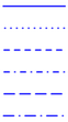
LineStyle

type

Line style, see list on the right (default is solid)

Line/Path style:

solid

dot

dash

dashdot

longdash

longdashdot

001_line_types

LineArrow

number

Line Arrow style type, number from 0 to 3 (default is 1)

The following Line Arrow types can be set:

0 = no Arrow
1 = Arrow
2 = Arrow and Distance
3 = Distance only

Further down, it's also possible to set the position of the Arrow or the Distance on the Line with ArrowPos.
The unit of the Distance is set in the feature unitsFactor in Extended Map Settings (default is km).

ArrowSize

number

Arrow size in pixel (default is 5)

Arrow size in pixel.

ArrowColor

color

Arrow color (default is red)

Arrow color - if not set, the Line color will be used.

When setting colors you can use Hex-Codes, HTML color names or RGB
Example: color red = #FF0000 or red or RGB(255, 0, 0)
(Detailed information in chapter The fx‑editor)

ArrowPos

number

Arrow position, number from 0 to 2 (default is 2)

Position of the Arrow or the Distance between two connected Points on the Line.

0 = end of Line
1 = beginning of Line
2 = center

Hint: Combine ArrowPos = 0 (Arrow at the end of the Line) and Endmarker Type = 0 (no Endmarker displayed).


GreatCircle two directions

Especially for GreatCircles (LineType = 2) there's a possibility to configure a "To-" and a "From/Back direction" in one GreatCircle. In this way you can display different Line styles, MouseOvers (Tooltips) and PopUps for each direction, without setting two separate Lines. Moreover, the system automatically detects the exact center, based on the actual geographical distance of the GreatCircle. 

The "second direction" is activated automatically, if any of the following settings is enabled. 
If the distance of the GreatCircle is displayed (LineArrow = 2 or 3), it obviosly shows the whole distance from Marker to Endmarker, not only one direction.

click to expand

click to expand

LineAnimIDGCB

text

alphabetical order of objects to be animated

Set order of animation for second parts of GreatCircle Lines.
To sort and arrange the order, in which objects should be animated, a special ID can be set here. Basically this ID is all in one for all objects. That means there are four settings like this:

for Dynamic Markers
for Dynamic Endmarkers
for Lines (this feature and the one above) and
for Dynamic Maps

The content of all these features is summed up and sorted alphabetically. The result is the order of animations.
If several objects have the same ID, they will be animated at the same time - in this way animation groups can be configured.

Animation properties itself (duration, effects) can be set in the Expert Settings.

000_pinGreatCircles with two directions have a special way of animation, when using the "Follow Path" effect (type = 6). The Line is not animated from Marker to Endmarker like all other Lines and Paths, but they are animated at the same time from each end of the line to their joint center.

LinePopupGCB

content

Line PopUp content

PopUp for second part of GreatCircle Lines.
A PopUp is a kind of dialog or a small window, that opens or "pops up" if you click on an item (Marker, Polygons, Lines...), for which a PopUp is defined. NPGeoMap can display text and dynamic content in a PopUp. Here you can configure a PopUp for Lines. The whole PopUp content can be edited with HTML.

000_warning Important: If you want to use local image files, you have to indicate the following Qlik Sense image path:

../Extensions/NPGeoMap_v2_3/images/[...]

Example with image:

& '#LinePopupGCB=' & '<div style="text-align:center; background:#F0F0F0; padding:5px; border: 5px solid gray;border-radius:10px "> PopUp <br>
           <img src="../Extensions/NPGeoMap_v2_3/images\flag.png" alt="Company Logo" style="align:center;width:50px;">
            </div>'

You can copy-paste this example to try it yourself!

If the feature "popupautoclose" is disabled in the Expert Settings, you may keep several PopUps open at the same time.

000_pinTip: There's a CSS file "info.css" located in the NPGeoMap Extension directory (subfolder "css"), which can be customized to define the default presentation of PopUps, MouseOvers and SketchBoxes.
(If you configure this file make sure to save a backup, when installing an NPGeoMap update - the actual file will probably be replaced.)

More information about integrating Qlik Sense fields or formulas and further details on notation see chapter fx‑Editor.

LineMouseOverGCB

content

Line MouseOver content


MouseOver (Tooltip) for second part of GreatCircle Lines.
It appears next to the cursor, if it hovers on a Dynamic Line or Path section.
This text may contain HTML, like for example a <br> tag to set a line break. Furthermore a delay and the duration time of MouseOvers can be configured in the Expert Settings.
Use Qlik Sense variables, fields and formulas for dynamic content.

Example:

& '#LineMouseOverGCB=' & 'Hello World'
Example with dynamic content (see sceenshot on the right):
& '#LineMouseOverGCB=' & CustomerName & ' from ' & Customerlocation & ',<br>Sales: ' & Money(CustomerTurnover)


000_warning Important: If you want to use local image files, you have to indicate the following Qlik Sense image path:

../Extensions/NPGeoMap_v2_3/images/[...]

Example with image:

& '#LineMouseOverGCB=' & '<div style="text-align:center; background:#F0F0F0; padding:5px; border: 5px solid gray;border-radius:10px "> MouseOver <br>
           <img src="../Extensions/NPGeoMap_v2_3/images\flag.png" alt="Company Logo" style="align:center;width:50px;">
            </div>'

You can copy-paste this example to try it yourself!

000_pinTip: There's a CSS file "info.css" located in the NPGeoMap Extension directory (subfolder "css"), which can be customized to define the default presentation of PopUps, MouseOvers and SketchBoxes.
(If you configure this file make sure to save a backup, when installing an NPGeoMap update - the actual file will probably be replaced.)

More information about integrating Qlik Sense fields or formulas and further details on notation see chapter fx‑Editor.

LineColorGCB

color

Line color of GreatCircle second part

Color for second parts of GreatCircle Lines.

When setting colors you can use Hex-Codes, HTML color names or RGB
Example: color red = #FF0000 or red or RGB(255, 0, 0)
(Detailed information in chapter fx‑Editor.

LineOpacityGCB

number

transparency of the Line in percent (default is 50)

Transparency for second parts of GreatCircle Lines in percent:

0% - colors are covering
100% - completely transparent

LineWidthGCB

number

Line width (default is 2)

Line width for second parts of GreatCircle Lines.

LineStyleGCB

type

Line style, see list on the right (default is solid)

Line style for second parts of GreatCircle Lines.

solid

dot

dash

dashdot

longdash

longdashdot

001_line_types


Line Bar Charts Settings

This feature displays Bar Charts along Lines or Path sections, if "Path" coordinates are set at the beginning of this dialog.
To enable Line Bar Charts set the LineType further above to three. They can be configured for both directions - forward and backward. Design your data model accordingly. 
The Bars are always created on the right side of the Lines or Path sections - please consider the direction your coordinates. It is not necessary to explicitly set the backward coordinates. If they follow the same rout as the ones for the forward Line/Path, the system generates it automatically. Please note, if they are set anyway, it may cost performance. 
 
Usage examples:

Transported cubic meters of goods on routs from stock to stock. Depending on the load, the height of the Bars vary.

Passengers on public transport routs. Depending on the amount of passengers, the height of the Bars vary.

click to expand

click to expand

Forward Bar Chart Data

Settings for the direction from A to B.

LBFData

data

number values determining the Bar height for each level

000_arrow Line Bar Forward Data

The here set number values determine the Bar height for each level.
Different kinds of values can be displayed in several stacked Bar levels. The first level is directly along the line, the second one is attached on the first one and so on. There's no system limitation for the number of levels.
The values for different Bar levels are separated with a "pipe" character*: |
Example (hard coded values):
& '#LBFData=' & '100|200'

Example (dynamic values):

& '#LBFData=' & Sum(Pax) & '|' & Sum(Tonnes)

The position of the entries separated by "pipe" correlate with the entries for Colors and MouseOvers below. This means the first data entry goes with the first Color and the first MouseOver entry, and so on.

*On American keyboards the pipe is located in the upper right corner, on British ones in the lower left. Most other European keyboards have in the third functional level of the keyboard, accessible with the "Alt Gr" key.
(See details about notation in chapter The fx‑editor).

LBFColors

colors

colors for each level

000_arrow Line Bar Forward Colors

These colors overwrite the default colors for Charts, which can be configured in the Expert Settings.
If there is more data than set colors, they're displayed in a loop - first the colors in this feature, then the default colors from the Expert Settings, then again the ones in this feature - and so on.
The color values for different Bar levels are separated with a "pipe" character*: |

Example:

& '#LBFColors=' & 'red|blue'

When setting colors you can use Hex-Codes, HTML color names or RGB
Example: color red = #FF0000 or red or RGB(255, 0, 0)

*On American keyboards the pipe is located in the upper right corner, on British ones in the lower left. Most other European keyboards have in the third functional level of the keyboard, accessible with the "Alt Gr" key.
(See details about notation in chapter The fx‑editor).

LBFMouseOvers

content

MouseOver content for each level

MouseOver (Tooltip) for Dynamic Lines and Paths.
It appears next to the cursor, if it hovers on a Dynamic Line or Path section.
This text may contain HTML, like for example a <br> tag to set a line break. Furthermore a delay and the duration time of MouseOvers can be configured in the Expert Settings.
Use Sense variables, fields and formulas for dynamic content.

Example:

& '#LBFMouseOvers=' & 'Hello World'
Example with dynamic content (see sceenshot on the right):
& '#LBFMouseOvers=' & CustomerName & ' from ' & Customerlocation & ',<br>Sales: ' & Money(CustomerTurnover)


000_warning Important: If you want to use local image files, you have to indicate the following Sense image path:

../Extensions/NPGeoMapSense_v2.50/images/[...]

Example with image:

& '#LBFMouseOvers=' & '<div style="text-align:center; background:#F0F0F0; padding:5px; border: 5px solid gray;border-radius:10px "> MouseOver <br>
           <img src="Extensions/NPGeoMap_v2_3/images\flag.png" alt="Company Logo" style="align:center;width:50px;">
            </div>'

You can copy-paste this example to try it yourself!

000_pinTip: There's a CSS file "info.css" located in the NPGeoMap Extension directory (subfolder "css"), which can be customized to define the default presentation of PopUps, MouseOvers and SketchBoxes.
(If you configure this file make sure to save a backup, when installing an NPGeoMap update - the actual file will probably be replaced.)

More information about integrating Sense fields or formulas and further details on notation see chapter fx-editor.

Backward Bar Chart Data

Settings for the direction from B to A.
The backward features follow the same rules as the forward ones above. It is not necessary to explicitly set the backward coordinates. If they follow the same rout as the ones for the forward Line/Path, the system generates it automatically. Please note, if they are set anyway, it may cost performance. 

LBBData

data

number values determining the Bar height for each level

000_arrow Line Bar Backward Data
Data records for each level of the backward direction.

LBBColors

colors

colors for each level

000_arrow Line Bar Backward Colors
Colors for each level of the backward direction.

LBBMouseOvers

content

MouseOver content for each level

000_arrow Line Bar Backward MouseOvers
MouseOvers for each level of the backward direction.